Flexbox layout for flexible, one-dimensional layouts.
CSS Flexbox, often shortened to Flexbox, is a powerful layout system that revolutionized web development. It provides a flexible and intuitive way to arrange and distribute elements within a container, making it a go-to tool for responsive layouts and intuitive designs. Let's explore the details with examples:
What is Flexbox?
Flexbox, a powerful CSS layout system, makes arranging and distributing web elements a breeze. Think of it as a container where items bend and adjust based on screen size and your preferences. You define the main direction (row or column) and how items align and fill space, resulting in responsive layouts that work beautifully on any device. Dive deeper and explore its flexibility to achieve complex, user-friendly designs!
What are the benefits of using Flexbox?
Flexbox empowers you to create responsive layouts that seamlessly adapt to different screen sizes. Forget complex calculations – Flexbox handles alignment and distribution with ease, letting you align items perfectly horizontally and vertically. But it doesn't stop there! Flexbox gives you fine-grained control over how items grow or shrink in the available space, ensuring optimal content presentation. Additionally, its intuitive syntax makes coding layouts enjoyable, while nested Flexbox opens doors to intricate and dynamic designs.
Flex Containers and Flex Items
Flexbox revolves around two key elements: Flex Containers and Flex Items. Understanding their roles and relationship is crucial for creating effective and responsive layouts.
Flex Containers
- Are parent elements responsible for holding and arranging items using Flexbox principles.
- Activated by setting the display property to flex on the desired element.
- Define the main layout direction (row or column) using the flex-direction property.
- Control overall distribution and alignment of items with properties like justify-content and align-items.
Flex Items
- Are direct children of the Flex Container, affected by its properties and contributing to the layout.
- Can be any HTML element, providing content and structure within the container.
- Have individual properties like flex-grow, flex-shrink, and order to fine-tune their size, growth, and positioning.
Simple Row with Equal-Sized Items:
HTML : Browser View
Here, the .container acts as the Flex Container, displaying its children (.item) as equally sized items in a row (default flex-direction).
Full Source:With flexbox, the items within the container will be arranged horizontally by default. You can adjust the layout further using additional flex properties like flex-direction, justify-content, align-items, etc., to achieve different layouts and alignments as needed.
Responsive Column with Growing Items:
HTML : Browser ViewThis example showcases a Flex Container displaying items in a column (flex-direction: column). Each item has flex-grow: 1, allowing them to expand and fill the container's height on different screen sizes.
Full Source:Flex containers, defined by the parent element, dictate the overall layout and organization of items within them. These items, known as flex items, contribute content and individual styling to the layout. By applying various flex properties to both containers and items, such as flex-grow, flex-shrink, and flex-basis, designers can manipulate size, spacing, alignment, and responsiveness with ease. This approach allows for dynamic and adaptable layouts that can adjust to different screen sizes and device orientations, providing a more seamless user experience.
Flex and Inline-flex
Both "flex" and "inline-flex" are values for the display property in CSS, used to activate Flexbox layout. However, there's a crucial difference in how they affect the container element itself:
Flex:
- Makes the container a block-level element, occupying the full width available on the line.
- Items inside are also arranged on a single line by default.
- Useful for creating standalone sections or full-width layouts.
Inline-flex
- Makes the container an inline element, only taking up space for its content and inline with other content.
- Items inside can wrap to multiple lines if content overflows.
- Suitable for scenarios where you want Flexbox behavior within the flow of inline content, like buttons or navigation menus.
Browser View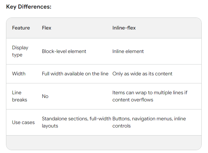
The Flex Container Properties
Flex containers, activated by setting display: flex on an element, come with several key properties that control their overall layout and behavior. Here's a breakdown of some important ones:
flex-direction:
Defines the main axis direction where items are laid out (default: row). Options include:
- row: Items placed horizontally from left to right.
- row-reverse: Same as row but in reverse order.
- column: Items stacked vertically from top to bottom.
- column-reverse: Same as column but in reverse order.
justify-content:
Controls how items are distributed along the main axis:
- flex-start: Items align to the start edge of the container.
- flex-end: Items align to the end edge of the container.
- center: Items are centered along the main axis.
- space-between: Distributes items with equal space between them.
- space-around: Distributes items with equal space around them (including before and after the first/last item).
align-items:
Controls how items are aligned along the cross axis (perpendicular to the main axis):
- flex-start: Items align to the start edge of the cross axis.
- flex-end: Items align to the end edge of the cross axis.
- center: Items are centered on the cross axis.
- stretch: Items stretch to fill the available space on the cross axis.
- baseline: Items align to their baselines (useful for text elements).
flex-wrap:
Determines how items wrap to multiple lines:
- nowrap: Items stay on a single line, overflowing if necessary.
- wrap: Items wrap to multiple lines if they don't fit on a single line.
- wrap-reverse: Similar to wrap but wraps in reverse order.
align-content:
Controls alignment of lines of items on the cross axis when there's extra space (only relevant with flex-wrap: wrap or wrap-reverse). Options include flex-start, flex-end, center, stretch, and space-between.
Additional Properties
- flex-grow: Controls how much items grow to fill extra space along the main axis (default: 0).
- flex-shrink: Controls how much items shrink to fit available space (default: 1).
- order: Specifies the stacking order of items (default: based on HTML source order).
Examples :
flex-direction: This property defines the direction in which flex items are placed in the flex container. It can be set to row, row-reverse, column, or column-reverse.The Flex Items Properties
While Flex Container properties define the overall layout, Flex Item properties enable you to customize individual items within the container. Here are some key ones:
flex-grow
Controls how much an item grows to fill extra space along the main axis.
- 0: Item won't grow (default).
- <number>: Grows proportionally to the value (e.g., flex-grow: 2 will grow twice as much as an item with flex-grow: 1).
- flex: Grows to fill all remaining space.
flex-shrink
Controls how much an item shrinks to fit in limited space along the main axis.
- 0: Item won't shrink (default).
- <number>: Shrinks proportionally to the value (e.g., flex-shrink: 3 will shrink three times faster than an item with flex-shrink: 1).
flex-basis
Defines the initial size of an item before considering flex-grow and flex-shrink.
- auto: Uses the item's natural size (default).
- <percentage>: Sets the size as a percentage of the container's available space.
- <length>: Sets the size as a specific length (e.g., px, em).
order
Controls the stacking order of items, overriding their HTML source order.
<number>: Specifies the order (e.g., order: 2 places the item second).align-self
Overrides the container's align-items property for a specific item, aligning it differently on the cross axis. Same options as align-items.
Examples:
order: This property specifies the order in which flex items appear within the flex container. By default, items have an order of 0. Positive or negative values can be used to reorder items accordingly.How to Center an Element With Flexbox
Centering elements with Flexbox is a fantastic way to achieve aesthetically pleasing and responsive layouts. Here are the different approaches you can use, along with examples:
Centering Horizontally
Using justify-content: center: This aligns all items within the container to the center along the main axis (horizontal by default).
HTML :Using margin: 0 auto; on the individual element
This centers the element within its available space (useful for single elements).
HTML :Centering Vertically
Using align-items: center: This aligns all items within the container to the center along the cross axis (vertical by default).HTML :
Combining justify-content
center and align-items: center: This centers all items both horizontally and vertically within the container.
HTML :Centering Both Horizontally and Vertically
Using flex: 1 1 auto; on the individual elementThis sets the element to grow and shrink to fill available space while remaining centered (works best with fixed container size).
HTML :Here's a comprehensive example that showcases various important functionalities of Flexbox:
Browser ViewThis example demonstrates the following key features of Flexbox:
Flex Container Properties:
- display: flex;: Defines the element as a flex container.
- flex-direction: Specifies the direction of the main axis (row or column).
- align-items: Aligns flex items along the cross axis.
- justify-content: Aligns flex items along the main axis.
Flex Item Properties:
- flex-grow, flex-shrink, flex-basis: Controls the flex item's ability to grow, shrink, and its initial size.
- order: Specifies the order of the flex items.
Responsive Design:
Utilizes media queries to change the flex-direction property for different screen sizes.
Styling Flex Items:
Applies styling to individual flex items.
Advanced Features | CSS Flexbox
Flexbox Control
Flexbox enhances layout control by allowing precise alignment, distribution, and item ordering through properties like order. This flexibility enables designers to create dynamic and responsive interfaces with ease, adapting to various screen sizes and design requirements.
Nested Flexbox
Utilizing nested Flexbox containers enables the creation of intricate and sophisticated layouts. By nesting Flexbox elements within each other, designers can achieve complex arrangements of content, managing alignment and spacing at multiple levels within the layout structure.
Grid Layout Integration
Grid Layout complements Flexbox by offering a robust solution for two-dimensional layouts. While Flexbox excels at controlling alignment along a single axis, Grid Layout extends this capability to both rows and columns, allowing designers to create more intricate and versatile layouts with precise control over both dimensions.
Conclusion
Flexbox is a CSS layout model that offers powerful tools for creating flexible and responsive web layouts. It allows designers to easily control the alignment, distribution, and order of elements within a container, facilitating dynamic and adaptable designs across various screen sizes and devices.