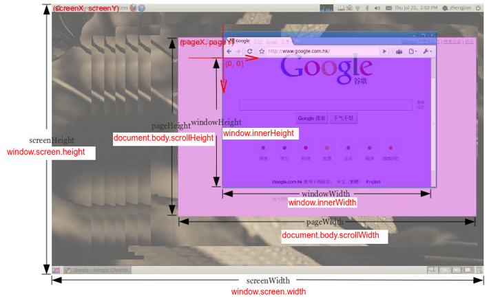
Get the size of the screen/browser window
The Viewport refers to the visible area of a web page that is presented to the user. Scrollbars allow users to navigate and explore other sections of the page that are not initially visible. Various web browsers may have distinct configurations for the size of the Viewport. To ensure consistent and optimized rendering across different devices, developers can utilize the "meta name="viewport"" tag. This meta tag allows you to define specific settings for how the content of your website should be displayed on various devices, offering a responsive and user-friendly experience across different screen sizes and orientations.
How to get the size of browser window?
The window.innerWidth and window.innerHeight properties provide the dimensions of the viewport window, excluding any browser toolbars or scrollbars that may be present. Similarly, in jQuery, utilizing $(window).width() and $(window).height() methods accomplishes the same objective by fetching the width and height of the viewport window.
These techniques allow developers to access and utilize the viewport dimensions, enabling responsive and dynamic design implementations that adapt to various screen sizes and resolutions. By utilizing these properties and methods, web applications can deliver a consistent and visually appealing user experience, ensuring optimal content presentation within the confines of the viewport, irrespective of the device or browser being used.
Size of browser viewport | JavaScript
Size of browser viewport | jQuery
How to get the size of HTML document?
In JavaScript, the document.body.clientWidth and document.body.clientHeight properties provide the width and height of the HTML document's content area, excluding any margins, paddings, or borders. Similarly, in jQuery, using $(document).width() and $(document).height() methods yields the same result by retrieving the width and height of the HTML document's content area.
These properties and methods enable developers to access precise dimensions of the content space, facilitating responsive design implementations and ensuring optimal layout and element positioning within the HTML document. By utilizing these features, web applications can deliver an enhanced and tailored user experience, presenting content with accurate dimensions while considering the overall structure of the HTML document.
Size of HTML document | JavaScript
Size of HTML document | jQuery
How to get the screen size in JavaScript?

the window.screen.width and window.screen.height properties allow developers to obtain the width and height of the user's screen or display. These properties are part of the screen object, which provides information about the user's screen, including its size, color depth, and other display-related details.
Screen size | javaScript
Conclusion
By using the screen object, developers can dynamically adjust their web applications' layout and design to optimize the user experience based on the screen size and available display space. This is particularly useful for creating responsive designs that adapt to various devices and resolutions, ensuring that the content is well-presented and accessible across different screens.
- Difference between using "let" and "var" in JavaScript
- How to Use Array forEach() in JavaScript
- How to Remove Duplicate Values from a JavaScript Array?
- How To Get a Timestamp in JavaScript
- Function Declarations vs. Function Expressions in JavaScript
- How to append values to an array in JavaScript?
- How To Remove a Property from a JavaScript Object
- Which equals operator (== vs ===) should be used in JavaScript comparisons?
- How to Capitalize the First Letter of Each Word in JavaScript
- Difference between setInterval and setTimeout in JavaScript
- Can't set headers after they are sent to the client
- Blocked by CORS policy: No 'Access-Control-Allow-Origin'