Learn CSS Box Model
The CSS Box Model is a fundamental concept in web development that describes how elements are rendered in a web page. Every element in HTML is considered as a rectangular box, and the box model describes the various parts of this box, including its content area, padding, border, and margin. This box, governed by the CSS box model, comprises four distinct yet interconnected parts:
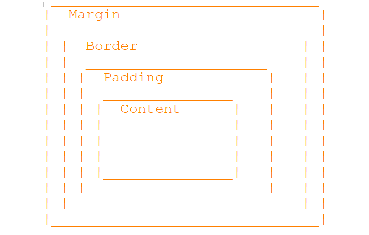
Content
The core area where text, images, or other media reside. Its dimensions are defined by width and height properties in the content box.
Padding
Padding is an essential aspect of CSS box model, defining the space between an element's content area and its border. It serves to provide internal spacing within the element, separating its content from the border. Padding can be specified individually for each side of the element using properties like padding-top, padding-right, padding-bottom, and padding-left, allowing for fine-grained control over the internal spacing. Alternatively, the shorthand property padding enables setting padding for all sides simultaneously, providing convenience and efficiency in coding.
Border
The border of an element forms a visual boundary that surrounds the padding and content area, enhancing its visual presentation and aiding in distinguishing one element from another. CSS provides various properties to customize the border according to design requirements, including border-width for controlling the thickness of the border, border-style for specifying its appearance (such as solid, dashed, or dotted), and border-color for defining the color of the border. Additionally, the shorthand property border allows setting all border properties at once, streamlining the process of styling borders for consistency across elements.
Margin
Margin is an essential aspect of the CSS box model, determining the space outside the border of an element, thereby influencing its positioning and layout within the document. By creating space between elements, margins help maintain visual separation and prevent clutter, improving overall readability and aesthetics. Margins can be specified individually for each side of the element using properties like margin-top, margin-right, margin-bottom, and margin-left, offering precise control over spacing. Alternatively, the shorthand property margin enables setting margins for all sides simultaneously, simplifying the coding process and improving code maintainability.
Understanding the box model is essential for creating layouts and controlling spacing and positioning of elements on a webpage. Here's a visual representation of the CSS box model:
Full Source Example: Browser View
Content Area
This is the content area with padding and border.
Inner Box
This is an inner box with its own padding and border.
- .container div represents the outer container with padding, border, and margin.
- .content div represents the content area with padding and border.
- .box div represents an inner box with its own padding, border, and margin.
Display Property (none, block, inline, inline-block)
Key Values and Their Effects:
display: none:This value hides the element completely. It won't take up any space in the layout, and it won't be rendered on the screen.
This value makes the element a block-level element. Block-level elements always start on a new line and take up the full width available to them. Default for many elements like headings, paragraphs, lists.
This value makes the element an inline-level element. Inline elements do not start on a new line, and they only take up as much width as necessary. Default for inline elements like spans, anchors.
This value combines aspects of both block and inline. It allows the element to behave like an inline-level element in terms of how it flows with surrounding content, but it also allows you to set a specific width, height, padding, and margin.
Browser ViewDisplay Property Example
Box-Sizing
The default box-sizing property in CSS is content-box, which means that the width and height properties apply only to the content box of an element. When padding and border are added, they increase the total width and height of the element. However, setting box-sizing: border-box changes this behavior, making the width and height properties include padding and border. This simplifies layout calculations, as the content area then adjusts automatically to accommodate the padding and border within the specified width and height. This approach is particularly useful for maintaining consistent layouts and simplifying responsive design, ensuring that elements behave predictably across different screen sizes and devices.
Additional Considerations:
Understanding the CSS box model is crucial for creating consistent, well-structured web layouts. It's important to note that the box model applies differently to inline and block-level elements, so being mindful of these distinctions is essential for proper layout design. Additionally, borders can collapse when adjacent, potentially affecting the overall layout. To prevent this, the CSS property border-collapse: separate can be used. By mastering these concepts, web developers can ensure that their designs are visually appealing, structurally sound, and maintain consistency across various browsers and devices.
Conclusion
The CSS box model is a fundamental concept in web development that defines the layout and spacing of elements on a webpage. It comprises four main components: content, padding, border, and margin, which collectively determine the size, spacing, and visual presentation of elements. Understanding and effectively utilizing the CSS box model is essential for creating well-structured, visually appealing web layouts.