Plotting graph using Seaborn: Python
Seaborn, a Python data visualization library, provides a wide range of advanced capabilities for creating compelling visualizations. With a high-level interface, it offers attractive and explanatory statistical graphics. By operating on Pandas DataFrames and NumPy arrays, Seaborn efficiently performs semantic mapping and statistical aggregation to produce insightful plots. As it is built on top of Matplotlib and closely integrated with pandas data structures, Seaborn complements these libraries to enhance the data visualization experience in Python.
Install Seaborn
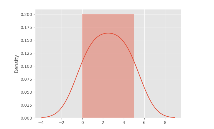
distplot - A Distplot or distribution plot shows the statistical distribution of data.
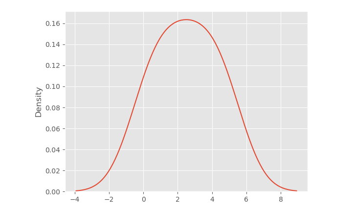
Distplot Without the Histogram
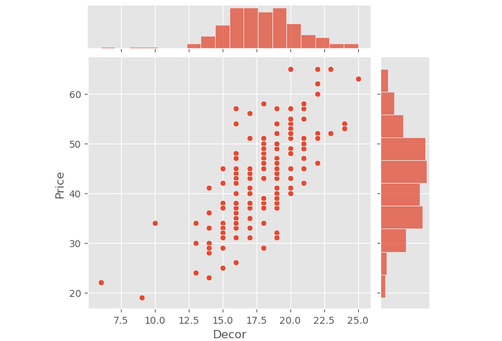
Joint Plot
The jointplot is used to output the mutual distribution of each column.
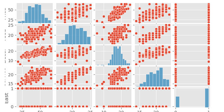
Pair Plot
The pairplot is a powerful type of distribution plot that generates joint plots for all possible combinations of numeric and Boolean columns in your dataset. It allows you to visualize the relationships and distributions between different variables, making it useful for exploratory data analysis and gaining insights into the data.
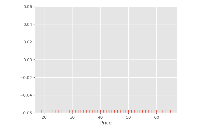
Rug Plot
The rug plot is a simple data visualization tool used to display individual data points along the x-axis of a plot. It draws small bars, or "ticks," at the position of each data point, providing a visual representation of the data's distribution and density. Rug plots are often used in combination with other plot types to enhance data exploration and analysis.
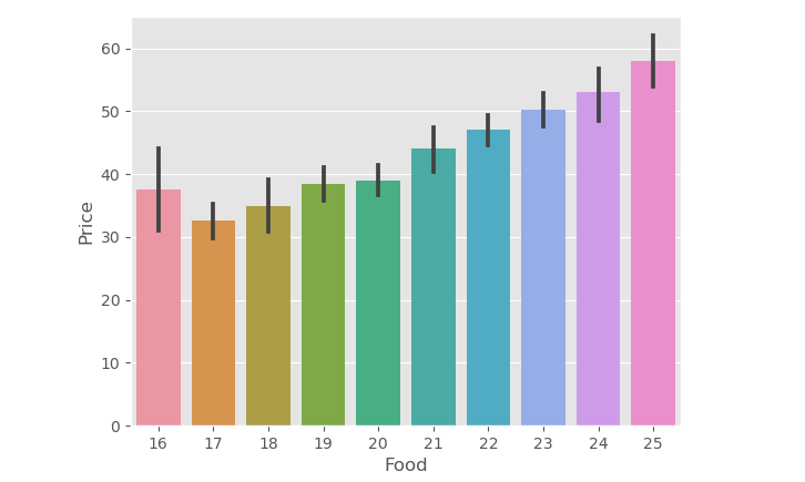
Bar Plot
A bar plot is commonly used to aggregate categorical data based on a specified method, where the default method is typically the mean. It provides a visual representation of the central tendency (e.g., mean) of different categories, making it useful for summarizing and comparing data across various groups. However, the aggregation method can be customized to display other statistics, such as median or sum, depending on the analysis requirements.
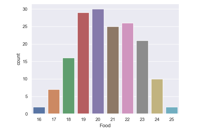
Count Plot
The count plot is a variation of the bar plot that specifically represents the count of categories in a particular column of the dataset. Instead of aggregating the data with a statistical method (e.g., mean), the count plot directly displays the frequency of each category, making it useful for visualizing categorical data distributions and identifying the most common categories within a dataset.
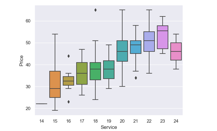
Box Plot
A box plot is a valuable tool for visualizing the distribution of quantitative data. It effectively summarizes the central tendency, spread, and potential outliers in a dataset, making it easier to compare variables or observe variations across levels of a categorical variable. The box plot's concise representation aids in identifying patterns and understanding the distributional characteristics of the data at a glance.
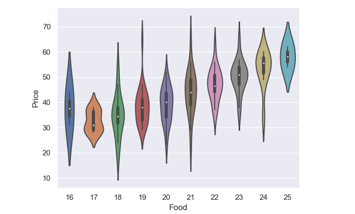
Violin plot
Violin plots are an extension of box plots that not only display the same summary statistics (such as median, quartiles, and potential outliers) but also incorporate Kernel Density Estimations (KDE) to depict the shape and distribution of the data. This additional information makes violin plots particularly useful for gaining insights into the data's underlying distribution and density, in addition to comparing summary statistics across different groups or categories.
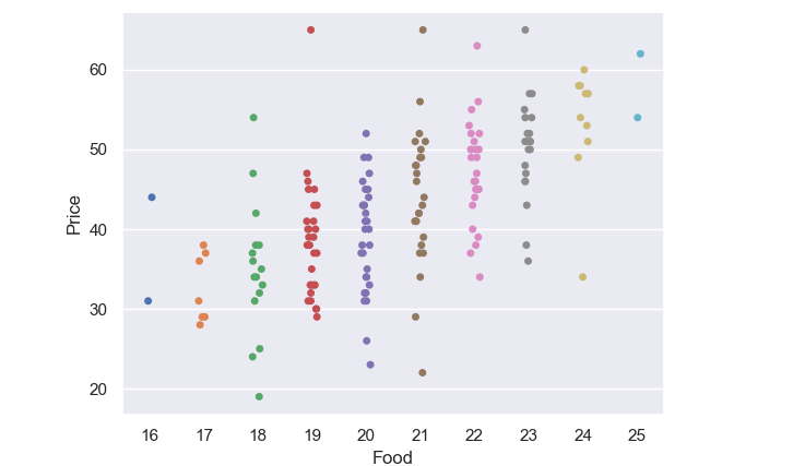
Strip Plot
A strip plot is a type of scatter plot where one of the variables is categorical. It represents individual data points along the categorical axis, providing a visual display of the distribution of data within each category. Strip plots can be combined with other plots, such as box plots or violin plots, to offer further insights and comparisons in data visualization and exploratory analysis.
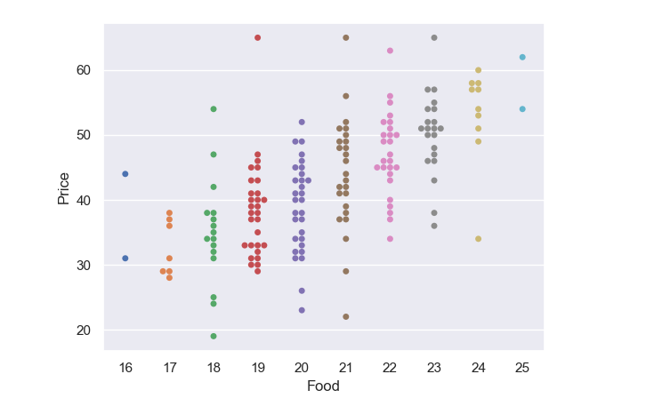
Swarm Plot
The swarm plot is indeed related to both strip plots and violin plots, but it is not a combination of the two. A swarm plot is a categorical scatter plot that represents individual data points along the categorical axis without overlapping them, making the distribution of data points more visible. It is different from strip plots, where the points can overlap, and from violin plots, which show the data distribution using KDEs. Swarm plots are useful for visualizing data points within each category while avoiding overlap, making it easier to observe the density and distribution of the data.
Conclusion
Seaborn in Python provides powerful and advanced data visualization capabilities, including various types of plots such as bar plots, box plots, violin plots, strip plots, and swarm plots. These visualization tools allow for clear and insightful representation of data distributions and relationships, making Seaborn an essential library for creating compelling and informative plots in Python.