Python Plotting With Matplotlib
Creating visually appealing figures and plots is a vital aspect of Data Science, and in Python, the go-to plotting package is matplotlib, written purely in Python. As one of the most widely used Python libraries for generating static, animated, and interactive visualizations, matplotlib offers both quick data visualization capabilities and the ability to produce professional-quality figures in various formats. Although highly customizable, finding the right settings for an attractive plot can be challenging. Furthermore, matplotlib optimizes performance, even for large arrays, by using NumPy arrays and other extension code.
Installing matplotlib
There are multiple ways to install matplotlib on your operating system, with the easiest approach being the use of the pip command. By simply executing pip install matplotlib, you can easily install the matplotlib library and start creating visualizations in Python. Open the command prompt, type the following command.
Once you can successfully install matplotlib library , then you are ready to continue.
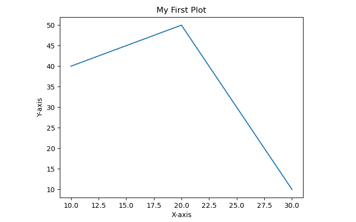
Example 1In the above code, import pyplot from matplotlib - use pyplot to "plot" some data to the canvas in memory and then use plt.show(), which is pyplot, to show what you've got.
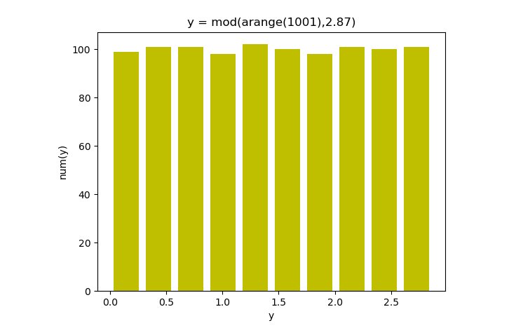
Example 2
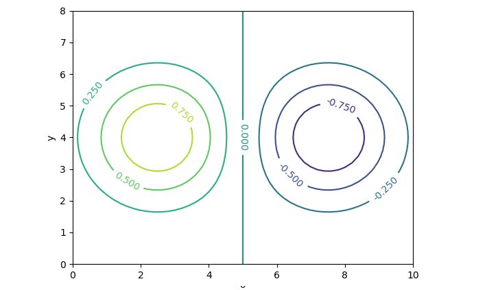
Example-3
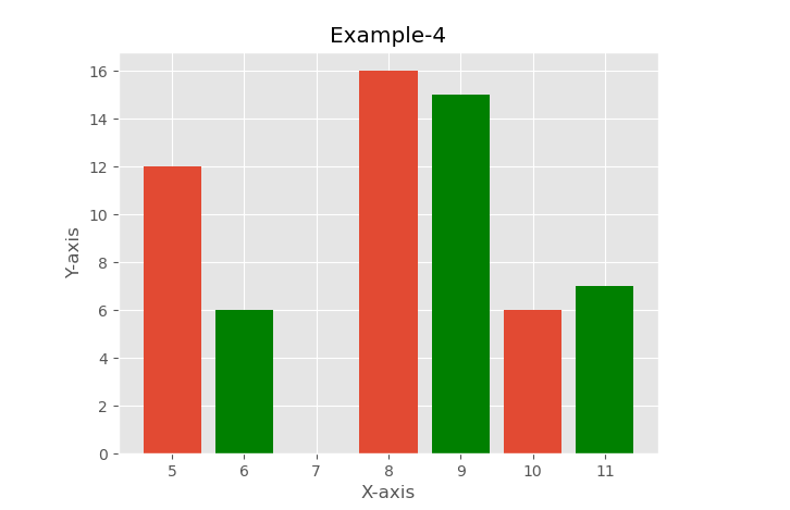
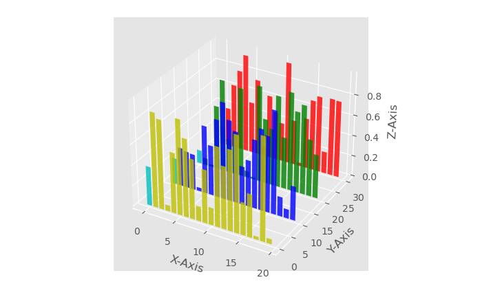
Example-4
Example-5
Conclusion
Python Plotting with Matplotlib offers a straightforward and versatile means to create compelling visualizations in Python. Utilizing the pip command to install matplotlib allows users to seamlessly access its powerful plotting capabilities and begin producing data-driven graphics with ease.