Area plot in R
An area chart is a data visualization that displays the cumulative magnitude of data series over time or categories. It is similar to a line chart but with the area beneath the line filled, allowing you to observe the changes in proportion among multiple data series.
Area Charts
Area charts are particularly useful for showing trends and comparing the contributions of different categories to the whole. The variable is plotted on the y-axis, and the time is plotted on the x-axis. The areas under the curves represent the values of the variable at different points in time.
In R, area charts can be created using the geom_area() function from the ggplot2 package. The syntax is as follows:
- data is the data frame that contains the data.
- time is the name of the variable that is plotted on the x-axis.
- value is the name of the variable that is plotted on the y-axis.
- fill is the color of the area.
For example, the following code creates an area chart of the number of active users on a website over time:
This will create an area chart with the time variable plotted on the x-axis and the active_users variable plotted on the y-axis. The area under the curve will represent the number of active users on the website at different points in time.
geom_area() function
The geom_area() function has many options that can be used to customize the appearance of the area chart. These options can be used to change the colors of the areas, the line styles, and the transparency of the areas.
For example, the following code changes the colors of the areas to red and green:
- The fill option specifies the colors of the areas.
In R, you can create area charts using various packages, with ggplot2 being a popular choice.
Install and Load Required Packages
Install the ggplot2 package if you haven't already and load it into your R session.
Create an Area Chart using ggplot2
To create an area chart using ggplot2, you can use the geom_area() function.
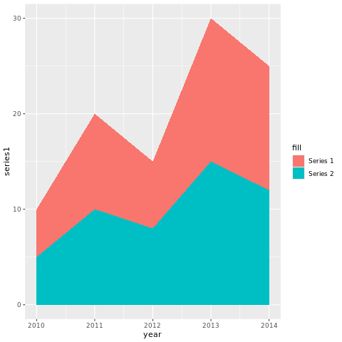
In this example, the year variable represents the x-axis values, and series1 and series2 represent the y-axis values for different data series.
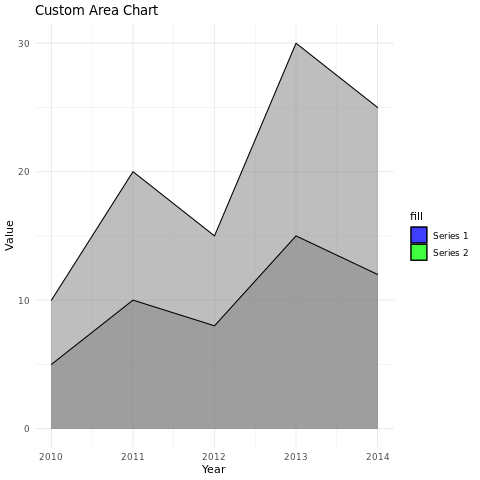
Customize the Area Chart
You can customize the area chart by adding additional layers, modifying axes, adding titles, adjusting colors, and more.
In this example, the alpha parameter is used to adjust the transparency of the areas. The scale_fill_manual() function is used to set custom fill colors for each series. The labs() function is used to set the title and axis labels, and the theme_minimal() function changes the plot's appearance.
Full Source | R Areachart ggplot
Output:
Conclusion
Area charts in R are a powerful way to visualize the trends and contributions of multiple data series over time or categories. By customizing aesthetics, adjusting transparency, and using different colors, you can create informative and visually appealing area charts for data analysis and presentation.