R Bar Plot
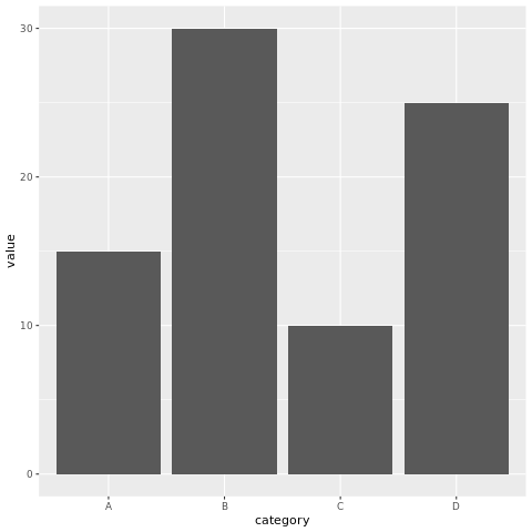
A bar chart is a common type of data visualization used to represent categorical data and compare the values of different categories. Each category is represented by a rectangular bar, where the length of the bar corresponds to the value of the category.
The categories are plotted on the x-axis, and the frequencies are plotted on the y-axis. The bars are used to represent the frequencies of the different categories.
In R, bar charts can be created using the barplot() function. The syntax is as follows:
- x is the name of the variable that contains the categories.
- y is the name of the variable that contains the frequencies.
For example, the following code creates a bar chart of the number of students in each grade:
This will create a bar chart with the grade variable plotted on the x-axis and the students variable plotted on the y-axis. The bars will represent the number of students in each grade.
barplot() function
The barplot() function has many options that can be used to customize the appearance of the bar chart. These options can be used to change the color of the bars, the width of the bars, and the labels on the x-axis and y-axis.
For example, the following code changes the color of the bars to red and the width of the bars to 2:
The col option specifies the color of the bars, and the width option specifies the width of the bars.
Bar charts in R using ggplot2
Install and Load Required Packages
Install the ggplot2 package if you haven't already and load it into your R session.
Create a Bar Chart using ggplot2
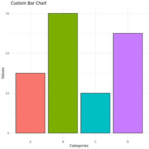
To create a bar chart using ggplot2, you start by specifying the data frame and mapping aesthetic attributes using the aes() function. Then, you add a geometric layer using the geom_bar() function to create the bar chart.
In this example, the category variable represents the categorical values on the x-axis, and the value variable represents the values on the y-axis.
Customize the Bar Chart
You can customize the bar chart by adding additional layers, modifying axes, adding titles, adjusting colors, and more. Here's an example of a bar chart with customized aesthetics:
In this example, the geom_bar() function's parameters are used to customize the color and border color of the bars. The labs() function is used to set the title and axis labels. The theme_minimal() function changes the plot's appearance, and theme(legend.position = "none") removes the legend.
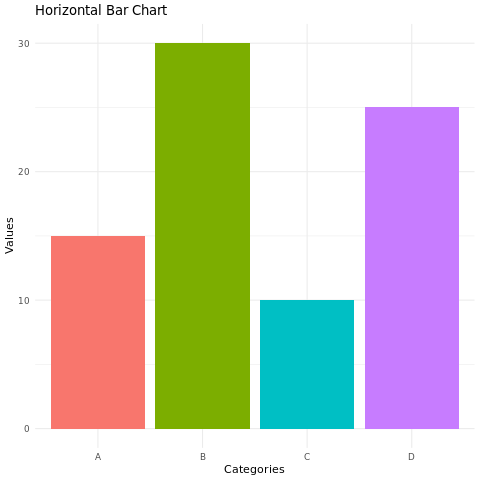
Horizontal Bar Chart
You can create a horizontal bar chart by using the coord_flip() function to flip the x and y axes.
In this example, the coord_flip() function flips the x and y axes to create a horizontal bar chart.
Full Source | R
Output:
Conclusion
Bar charts in R are easily created using the ggplot2 package. They are effective for visualizing categorical data and comparing values across different categories. By customizing aesthetic attributes, adding layers, and creating horizontal bar charts, you can create informative and visually appealing bar charts for data analysis and presentation.