Pie Chart in R
A pie chart is a circular graph that represents data as slices of a pie. Each slice's size corresponds to the proportion of data it represents within the whole dataset.
Pie charts are often used to show the composition of a whole in terms of percentages or proportions. The proportions are represented by slices of a pie, and the size of each slice is proportional to the value of the category.
In R, pie charts can be created using the pie() function. The syntax is as follows:
- x is the name of the variable that contains the categories.
For example, the following code creates a pie chart of the number of students in each grade:
This will create a pie chart with the grade variable plotted on the y-axis. The slices of the pie will represent the number of students in each grade.
pie() function
The pie() function has many options that can be used to customize the appearance of the pie chart. These options can be used to change the colors of the slices, the labels on the slices, and the direction of the pie.
For example, the following code changes the colors of the slices to red, yellow, and green:
- The col option specifies the colors of the slices.
In R, you can create pie charts using the base graphics system or various packages, such as ggplot2 and plotly.
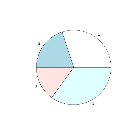
Create a Pie Chart in R using Base Graphics
To create a pie chart using the base graphics system, you can use the pie() function.
In this example, the data vector contains the values you want to visualize as a pie chart.
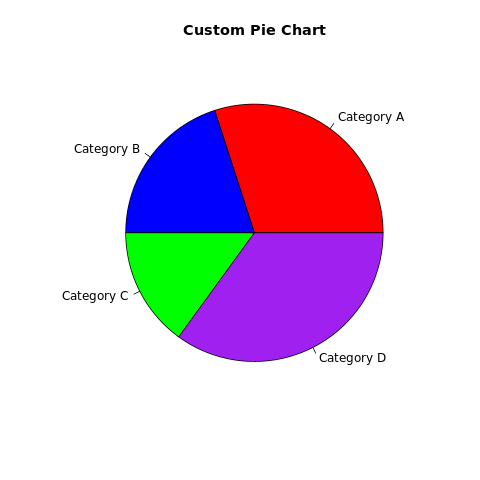
Customize the Pie Chart
You can customize the pie chart by adjusting parameters and adding labels and titles.
In this example, the labels parameter provides labels for each slice, and the col parameter sets custom colors for each slice. The main parameter sets the title.
Full Source | R Pie chart
Output:
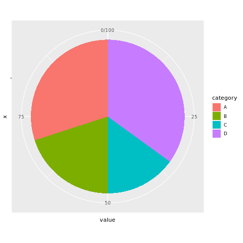
Pie Chart in R using ggplot2
Install and Load Required Packages
Install the ggplot2 package if you haven't already and load it into your R session.
Create a Pie Chart using ggplot2
To create a pie chart using ggplot2, you can use the geom_bar() function with a polar coordinate system.
Full Source | R Piechart
Output:
Create a Pie Chart in R using plotly
Install and Load Required Packages
Install the plotly package if you haven't already and load it into your R session.
Create a Pie Chart using plotly
To create an interactive pie chart using plotly, you can use the plot_ly() function.
Full Source | R Pie Chart Plotly
Conclusion
Pie charts in R can be created using the base graphics system's pie() function, the ggplot2 package with polar coordinates, or the plotly package for interactive visualizations. Pie charts are suitable for displaying proportions and percentages in a circular format. By customizing colors, adding labels, and using different packages, you can create informative and visually appealing pie charts for data analysis and presentation.