Density Chart in R
A density plot, also known as a kernel density plot, is a data visualization that represents the distribution of a continuous variable as a smoothed curve. It's similar to a histogram but offers a smoother representation of the data's underlying distribution.
Density plots are particularly useful for understanding the shape, central tendency, and spread of continuous data. The variable is plotted on the x-axis, and the density of the distribution is plotted on the y-axis. The density is represented by a curve, and the height of the curve at a particular point represents the probability that a randomly selected value from the distribution will be less than or equal to that point.
In R, density plots can be created using the density() function. The syntax is as follows:
- x is the name of the variable that is being plotted.
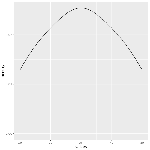
For example, the following code creates a density plot of the height variable:
This will create a density plot with the height variable plotted on the x-axis and the density of the distribution plotted on the y-axis. The curve will show the probability that a randomly selected value from the height variable will be less than or equal to a particular height.
density() function
The density() function has many options that can be used to customize the appearance of the density plot. These options can be used to change the colors of the curve, the line styles, and the transparency of the curve.
For example, the following code changes the colors of the curve to red and green:
- The col option specifies the colors of the curve.
Install and Load Required Packages
Install the ggplot2 package if you haven't already and load it into your R session.
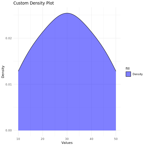
Create a Density Plot using ggplot2
To create a density plot using ggplot2, you can use the geom_density() function.
In this example, the values variable represents the continuous data you want to visualize as a density plot.
Customize the Density Plot
You can customize the density plot by adding additional layers, modifying axes, adding titles, adjusting colors, and more.
In this example, the alpha parameter is used to adjust the transparency of the density curve. The labs() function is used to set the title and axis labels. The scale_fill_manual() function is used to set the fill color of the density curve area. The theme_minimal() function changes the plot's appearance.
Full Source Code | Density Plot in R - ggplot
Output:
Conclusion
Density plots in R provide a smooth and informative way to visualize the distribution of continuous data. By customizing aesthetics, adjusting transparency, and using different colors, you can create visually appealing density plots for data analysis and presentation.