R Histogram
A histogram is a graphical representation used to display the distribution of continuous data. It groups the data into bins or intervals and shows the frequency or count of observations falling into each bin.
Histograms are particularly useful for understanding the underlying patterns, central tendency, and spread of data. The variable is divided into bins, and the number of observations in each bin is plotted. The height of the bars in the histogram represents the number of observations in each bin.
In R, histograms can be created using the hist() function. The syntax is as follows:
- x is the name of the variable that is being plotted.
For example, the following code creates a histogram of the height variable:
This will create a histogram with the height variable plotted on the x-axis. The bars will represent the number of observations in each bin.
hist() function
The hist() function has many options that can be used to customize the appearance of the histogram. These options can be used to change the number of bins, the width of the bars, and the colors of the bars.
For example, the following code changes the number of bins to 10 and the width of the bars to 2:
The breaks option specifies the number of bins, and the width option specifies the width of the bars.
In R, you can create histograms using various packages, with ggplot2 and the base graphics system being common choices.
R Histogram Using ggplot2 Package
Install and Load Required Packages
Install the ggplot2 package if you haven't already and load it into your R session.
Create a Histogram using ggplot2
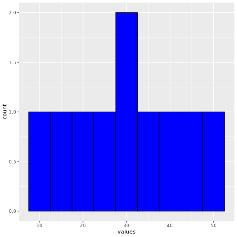
To create a histogram using ggplot2, you start by specifying the data frame and mapping aesthetic attributes using the aes() function. Then, you add a geometric layer using the geom_histogram() function to create the histogram.
In this example, the values variable represents the continuous data you want to create a histogram for.
Customize the Histogram
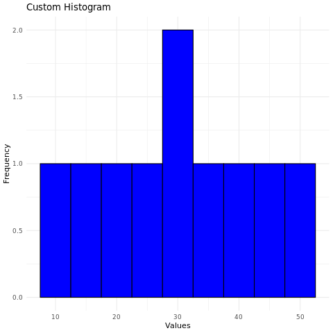
You can customize the histogram by adding additional layers, modifying axes, adding titles, adjusting colors, and more.
In this example, the geom_histogram() function's parameters are used to customize the fill color and border color of the bars. The labs() function is used to set the title and axis labels. The theme_minimal() function changes the plot's appearance.
Full Source | R histogram ggplot2
Output:
R Histogram using Base Graphics
Create a Histogram using Base Graphics
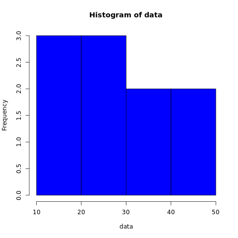
To create a histogram using base graphics, you can use the hist() function.
In this example, the data vector contains the continuous data you want to create a histogram for. The breaks parameter specifies the number of bins.
Customize the Histogram
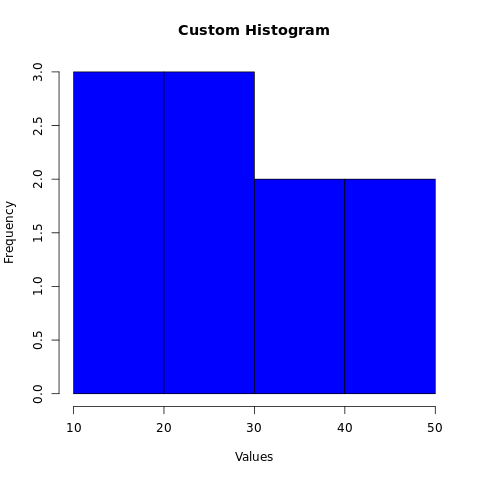
You can customize the histogram by adjusting parameters and adding titles.
In this example, the main parameter is used to set the title, and the xlab and ylab parameters are used to set the axis labels.
Full Source | R histogram Base Graphics
Output:
Conclusion
Histograms in R are easily created using the ggplot2 package or the base graphics system. They provide insights into the distribution of continuous data and can be customized for better visualization. By adjusting bin widths, colors, borders, and labels, you can create informative and visually appealing histograms for data analysis and presentation.