Create Heatmap in R
A heatmap is a graphical representation used to visualize the values of a matrix or a table of data as a grid of colors. It's particularly useful for identifying patterns, correlations, and trends within complex datasets.
Heatmaps are commonly used in various fields, including biology, finance, and data analysis. In R, you can create heatmaps using various packages, with heatmap() from the base graphics system and heatmap.2() from the gplots package being common choices.
Create a Heatmap using Base Graphics
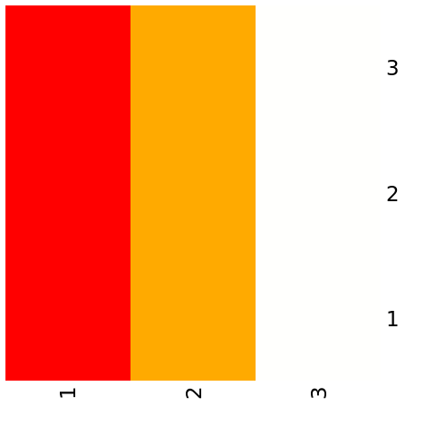
To create a heatmap using the base graphics system, you can use the heatmap() function.
In this example, the data matrix contains the values you want to visualize as a heatmap.
Customize the Heatmap
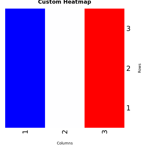
You can customize the heatmap by adjusting parameters and adding color scales.
In this example, the col parameter is used to define a custom color scale. The main parameter sets the title, and the xlab and ylab parameters set the axis labels.
Full Source | R heatmap using Base Graphics
Output:
Create a Heatmap using gplots Package (heatmap.2())
Install and Load Required Packages
Install the gplots package if you haven't already and load it into your R session.
Create a Heatmap using heatmap.2()
To create a heatmap using the gplots package, you can use the heatmap.2() function.
Customize the Heatmap
You can customize the heatmap using various parameters provided by heatmap.2().
Full Source | R Heatmap using gplots
Conclusion
Heatmaps in R can be created using the base graphics system's heatmap() function or the heatmap.2() function from the gplots package. Heatmaps are effective for visualizing patterns and relationships within matrices of data. By adjusting parameters, adding color scales, and customizing labels, you can create informative and visually appealing heatmaps for data analysis and presentation.