R Line Chart
A line chart, also known as a line plot or line graph, is a popular data visualization that displays data points connected by straight lines. It's often used to show trends, changes over time, and the relationship between two variables.
The variable is plotted on the y-axis, and the time is plotted on the x-axis. The points are connected by lines to show the trend of the variable over time.
R - Line Graphs
In R, line charts can be created using the plot() function. The syntax is as follows:
- x is the name of the variable that is plotted on the x-axis.
- y is the name of the variable that is plotted on the y-axis.
For example, the following code creates a line chart of the temperature variable over time:
This will create a line chart with the temperature variable plotted on the y-axis and the time variable plotted on the x-axis. The points will be connected by lines.
plot() function
The plot() function has many options that can be used to customize the appearance of the line chart. These options can be used to change the color of the line, the thickness of the line, and the style of the line.
For example, the following code changes the color of the line to red and the thickness of the line to 2:
The col option specifies the color of the line, and the lwd option specifies the thickness of the line.
In R, you can create line charts using various packages, with ggplot2 being a common choice.
Install and Load Required Packages
Install the ggplot2 package if you haven't already and load it into your R session.
Create a Line Chart using ggplot2
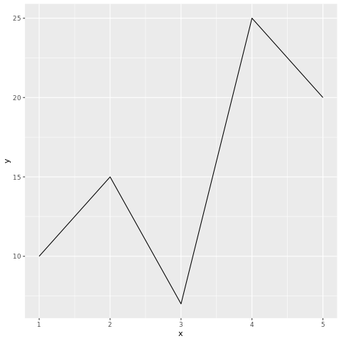
To create a line chart using ggplot2, you start by specifying the data frame and mapping aesthetic attributes using the aes() function. Then, you add a geometric layer using the geom_line() function to create the line chart.
In this example, the x variable represents the values on the x-axis, and the y variable represents the values on the y-axis.
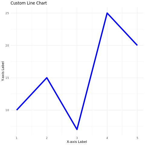
Customize the Line Chart
You can customize the line chart by adding additional layers, modifying axes, adding titles, adjusting colors, and more.
In this example, the geom_line() function's parameters are used to customize the color and size of the lines. The labs() function is used to set the title and axis labels. The theme_minimal() function changes the plot's appearance.
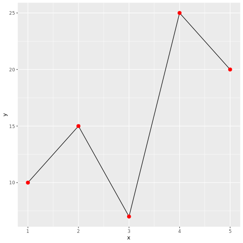
Adding Points to the Line Chart
You can add data points to the line chart using the geom_point() function.
In this example, the geom_point() function adds red points on top of the line chart.
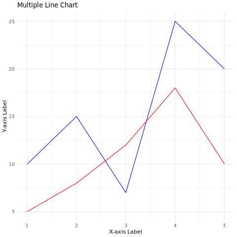
Adding Multiple Lines
You can add multiple lines to a single line chart using different data frames and the geom_line() function.
In this example, two lines with different colors are added to the same chart.
Full Source | R
Output:
Conclusion
Line charts in R are easily created using the ggplot2 package. They are effective for visualizing trends and relationships between two numeric variables. By customizing aesthetic attributes, adding points, and displaying multiple lines, you can create informative and visually appealing line charts for data analysis and presentation.