Boxplots in R Language
A box plot, also known as a box-and-whisker plot, is a data visualization that displays the distribution of a dataset's summary statistics, including its median, quartiles, and potential outliers. It's particularly useful for comparing the distribution of multiple datasets and identifying potential skewness or variability.
The box plot consists of a box, whiskers, and outliers. The box represents the middle 50% of the data, and the whiskers extend to the most extreme data points that are not outliers. Outliers are plotted as individual points.
In R, box plots can be created using the boxplot() function. The syntax is as follows:
- x is the name of the variable that is being plotted.
For example, the following code creates a box plot of the height variable:
This will create a box plot with the height variable plotted on the y-axis. The box will represent the middle 50% of the data, and the whiskers will extend to the most extreme data points that are not outliers. Outliers will be plotted as individual points.
boxplot() function
The boxplot() function has many options that can be used to customize the appearance of the box plot. These options can be used to change the colors of the box, the whiskers, and the outliers.
For example, the following code changes the color of the box to red and the color of the whiskers to blue:
The col option specifies the color of the box, and the whisker option specifies the color of the whisker
In R, you can create box plots using various packages, with ggplot2 and the base graphics system being common choices.
R Box Plot using ggplot2 Package
Install and Load Required Packages
Install the ggplot2 package if you haven't already and load it into your R session.
Create a Box Plot using ggplot2
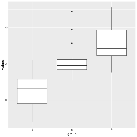
To create a box plot using ggplot2, you start by specifying the data frame and mapping aesthetic attributes using the aes() function. Then, you add a geometric layer using the geom_boxplot() function to create the box plot.
In this example, the group variable represents the categorical groups on the x-axis, and the values variable represents the values on the y-axis.
Customize the Box Plot
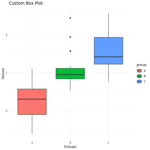
You can customize the box plot by adding additional layers, modifying axes, adding titles, adjusting colors, and more. Here's an example of a customized box plot:
In this example, the geom_boxplot() function's parameters are used to customize the fill color of the boxes. The labs() function is used to set the title and axis labels. The theme_minimal() function changes the plot's appearance.
Full Source | R Boxplot - ggplot2
Output:
R Box PLot using Base Graphics
Create a Box Plot using Base Graphics
To create a box plot using base graphics, you can use the boxplot() function.
In this example, the data list contains multiple datasets corresponding to different groups.
Customize the Box Plot
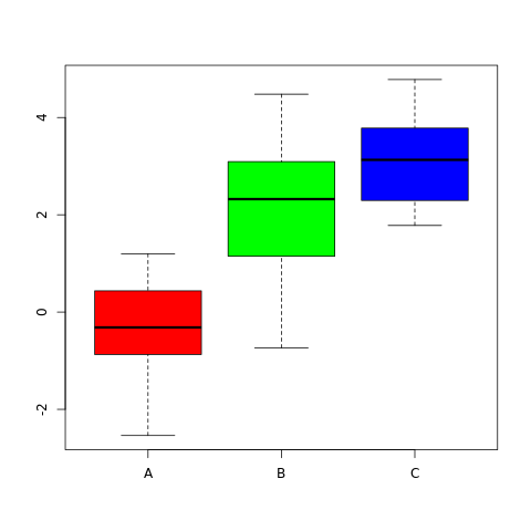
You can customize the box plot by adjusting parameters and adding titles.
In this example, the main parameter is used to set the title, and the xlab and ylab parameters are used to set the axis labels.
Full Source | R Boxplot - Base Graphics
Output:

Conclusion
Box plots in R are easily created using the ggplot2 package or the base graphics system. They provide insights into the distribution of data within different groups and can be customized for better visualization. By adjusting colors, adding titles, and comparing multiple datasets, you can create informative and visually appealing box plots for data analysis and presentation.