R - Scatterplots
A scatter plot is a fundamental data visualization that displays individual data points as dots on a two-dimensional plane. It's commonly used to visualize the relationship between two numeric variables and identify patterns, trends, or correlations.
The variables are plotted on the x-axis and y-axis, and the points are connected by lines. The pattern of the points can be used to infer the relationship between the two variables.
Scatter plots in R
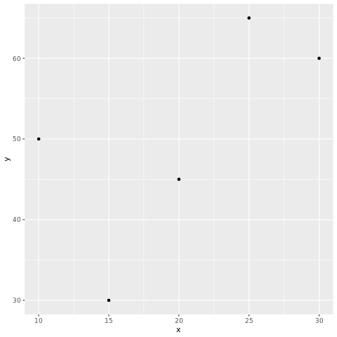
In R, scatter plots can be created using the plot() function. The syntax is as follows:
- x is the name of the variable that is plotted on the x-axis.
- y is the name of the variable that is plotted on the y-axis.
For example, the following code creates a scatter plot of the height and weight variables:
This will create a scatter plot with the height variable plotted on the x-axis and the weight variable plotted on the y-axis. The points will be connected by lines.
plot() function
The plot() function has many options that can be used to customize the appearance of the scatter plot. These options can be used to change the color of the points, the size of the points, and the type of line that connects the points.
For example, the following code changes the color of the points to red and the size of the points to 2:
The col option specifies the color of the points, and the cex option specifies the size of the points.
In R, you can create scatter plots using various packages, with ggplot2 being a popular choice.
Install and Load Required Packages
Install the ggplot2 package if you haven't already and load it into your R session.
Create a Scatter Plot using ggplot2
To create a scatter plot using ggplot2, you start by specifying the data frame and mapping aesthetic attributes using the aes() function. Then, you add a geometric layer using the geom_point() function to create the scatter plot.
In this example, the x variable represents the values on the x-axis, and the y variable represents the values on the y-axis.
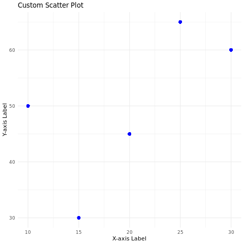
Customize the Scatter Plot
You can customize the scatter plot by adding additional layers, modifying axes, adding titles, adjusting colors, and more. Here's an example of a scatter plot with customized aesthetics:
In this example, the geom_point() function's parameters are used to customize the color, size, and shape of the points. The labs() function is used to set the title and axis labels. The theme_minimal() function changes the plot's appearance.
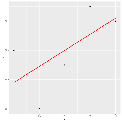
Adding Regression Line
You can add a regression line to a scatter plot using the geom_smooth() function.
In this example, the geom_smooth() function adds a linear regression line using the "lm" method.
Full Source | R
Output:
Conclusion
Scatter plots in R are easily created using the ggplot2 package. They're effective for visualizing relationships between two numeric variables and can be customized using various aesthetic attributes and additional layers to enhance their interpretability and communicative power.